UX Case Study
Project Overview
the problem
People having multiple jobs don’t have time to study a course like Coursera's and even though Google courses are offered for free; Coursera charges a monthly fee which creates an economic pain point.
the goal
Design an app that hosts synthesized Certificate Courses without the stress of tests, offering learning materials for everyone, 100% free of cost.
the product
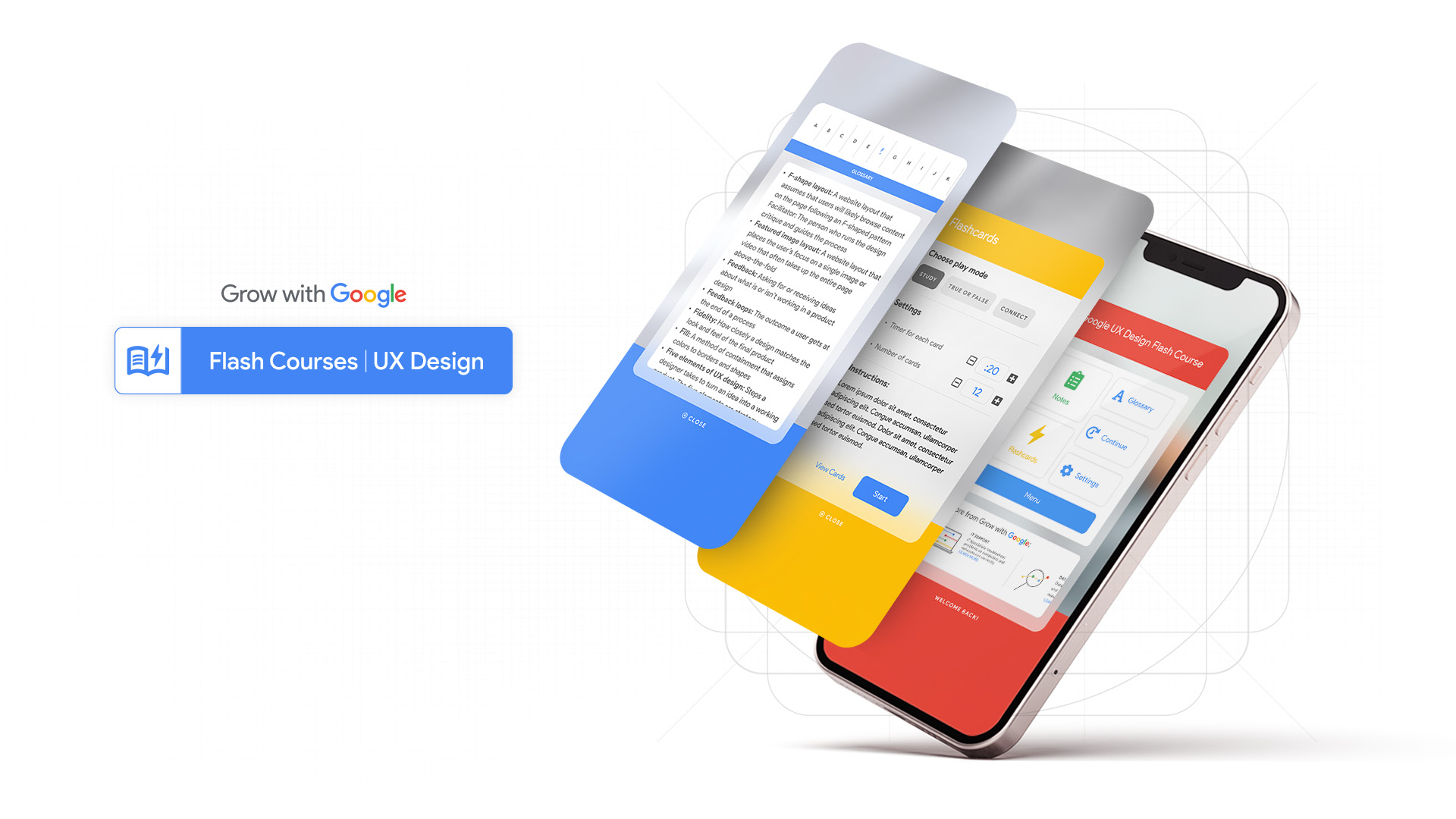
Flash Courses from Grow with Google, is a new entity focused on education for quick learners and people wanting to get new skills but don’t have the time to take a 6+ month course. The organization needs a tool that helps people acquire new skills without wasting time. Our primary target includes people with multiple activities and adults who are interested in learning new skills.
my role
UX designer, leader, researcher. Taking the app and responsive website design from ideation, to conception and delivery.
project duration
September 2021 to November 2021.
responsibilities
Conducting interviews, user research including affinity diagrams and creating paper and digital wireframing, low and high-fidelity prototyping, conducting usability studies, accounting for accessibility, iterating on designs, determining information architecture, visual and responsive design.
Understanding the User
I used Coursera’s reviews and comments from each activity to develop interview questions, which were then used to conduct user interviews. After creating an affinity diagram and organizing my data. Most interviewed participants reported feeling bad about the poor control that Coursera offers, in plagiarism and how students pass without leaving comments after completing activities. The feedback received through research made it very clear that users would be open and willing to study the course if we would eliminate Coursera as the hosting site and that they would prefer to study directly from a Google App without the necessity of paying.
ADDITIONAL USER PAIN POINTS
experience
There is a general frustration between users that really want to study the course and those people that do not comment or collaborate on exercises.
plagiarism
Some bloggers have written reviews on Google's UX Design certificate program and there are people commenting on the internet about users copying work from others and submitting it as their own.
language
For many students, English is not their first language, this course is only offered in English leaving the majority of the world's population out of the possibility to educate themselves.
PERSONAS & PROBLEM STATEMENT
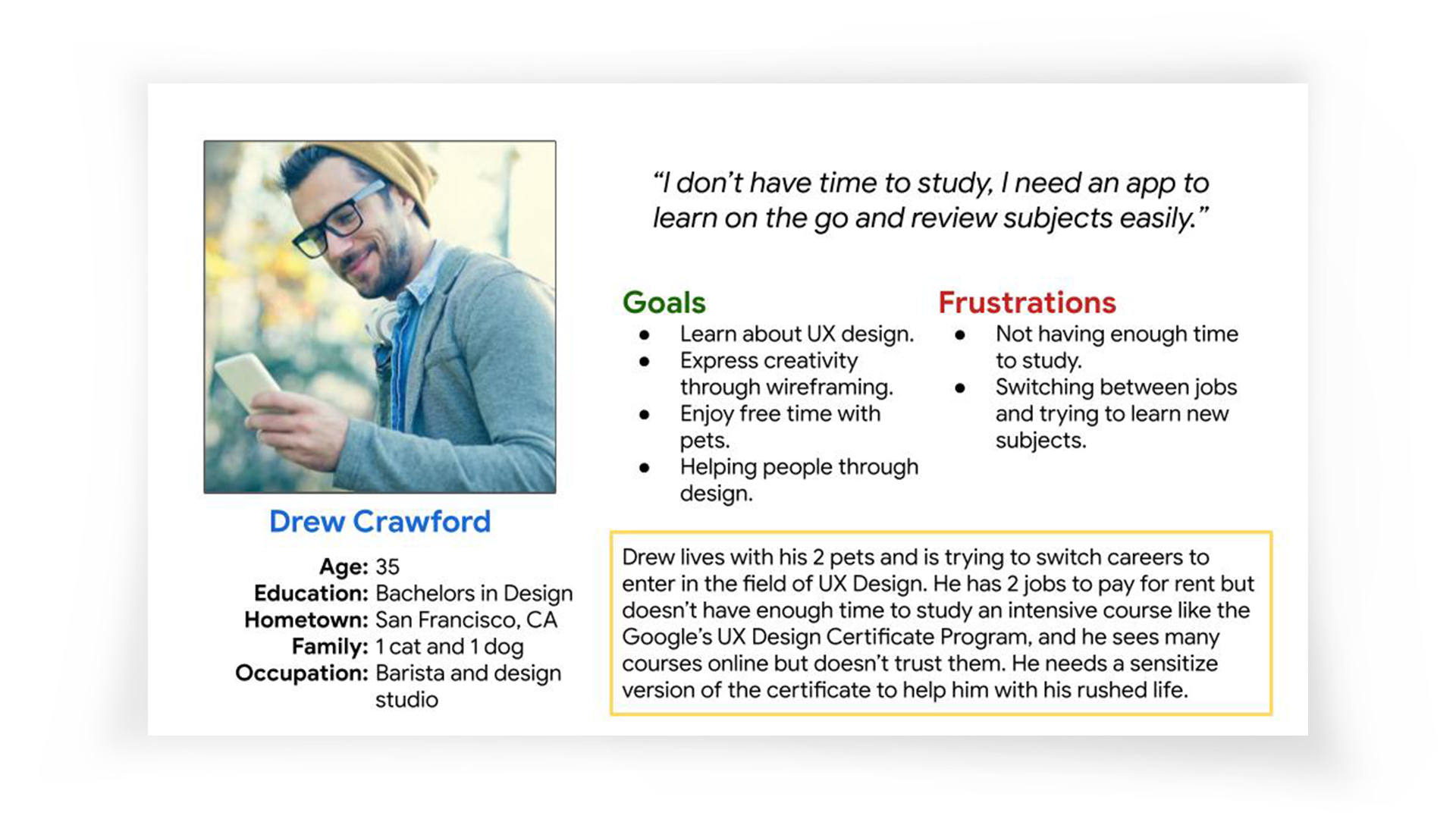
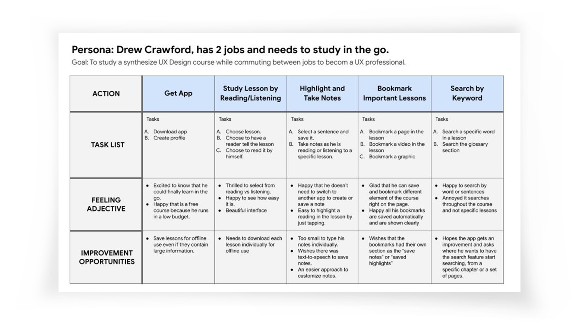
Drew has two jobs and needs to study a synthesized course in the go because he doesn’t have time to study a full course and he could take advantage of doing something productive while commuting.
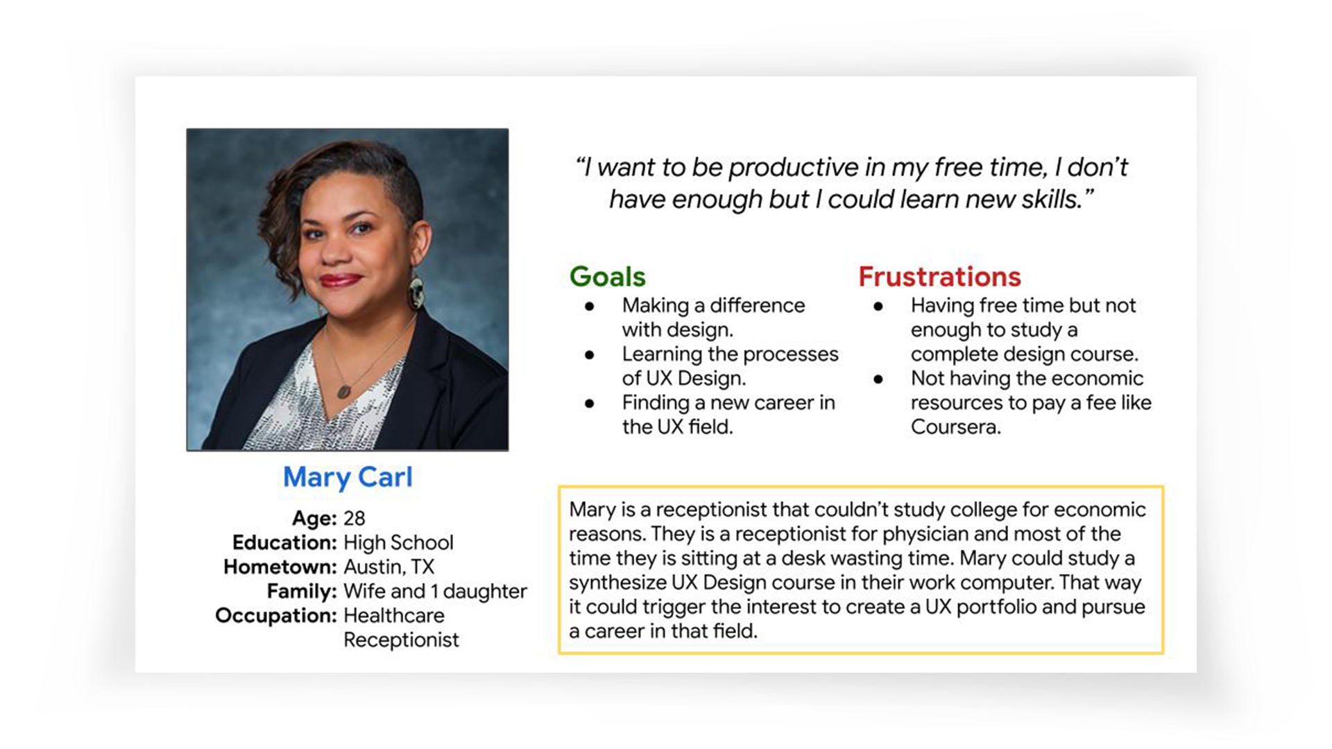
Mary is a receptionist who needs to occupy her free time during work to study a synthesized UX course because she wants to switch paths in their career and become a UX Designer in the near future.
USER JOURNEY MAP
Competitive Audit
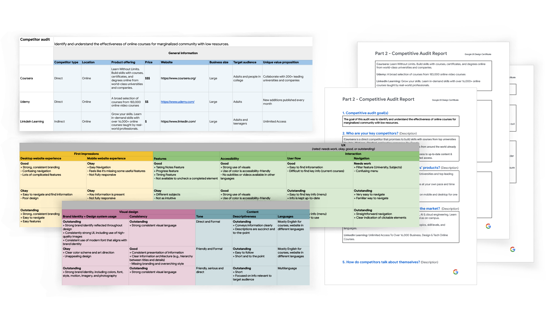
An audit of a few competitor’s products provided direction on gaps and opportunities to address with the Flash Course app. Click to view the full competitive audit and audit report.
Starting the Design
SITEMAP
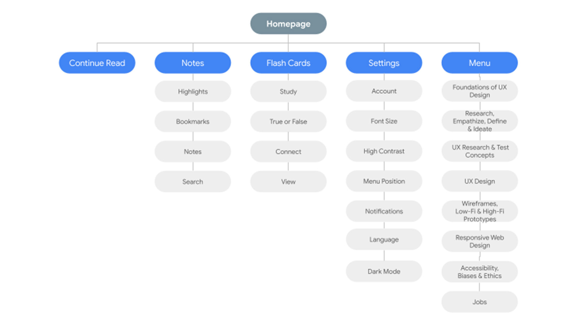
I started working on designing the Information Architecture. I reorganized the lectures from Google's UX Design Certificate course in a more cohesive manner and did a synthesized menu for the content of the course itself.
IDEATION
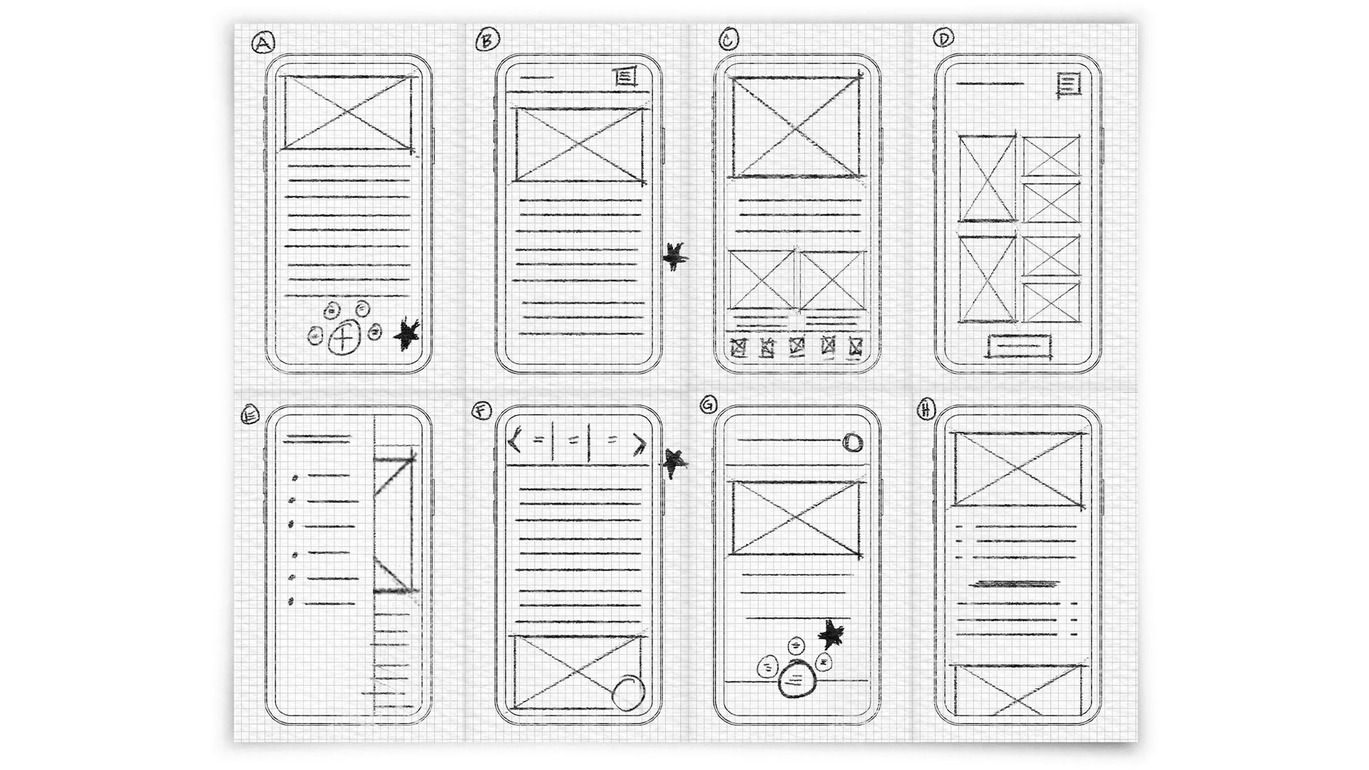
I did a quick ideation exercise with Crazy 8's to come up with ideas for how to address gaps identified in the competitive audit. My focus was specifically on having an appealing interface in which users would feel comfortable studying. Taking the time to draft iterations of each screen of the app on paper ensured that the elements that made it to digital wireframes would be well-suited to address user pain points. For the home screen, I prioritized a quick and easy menu with large buttons to help users save time. Stars were used to mark the elements of each sketch that would be used in the initial digital wireframes.
DIGITAL WIREFRAMES
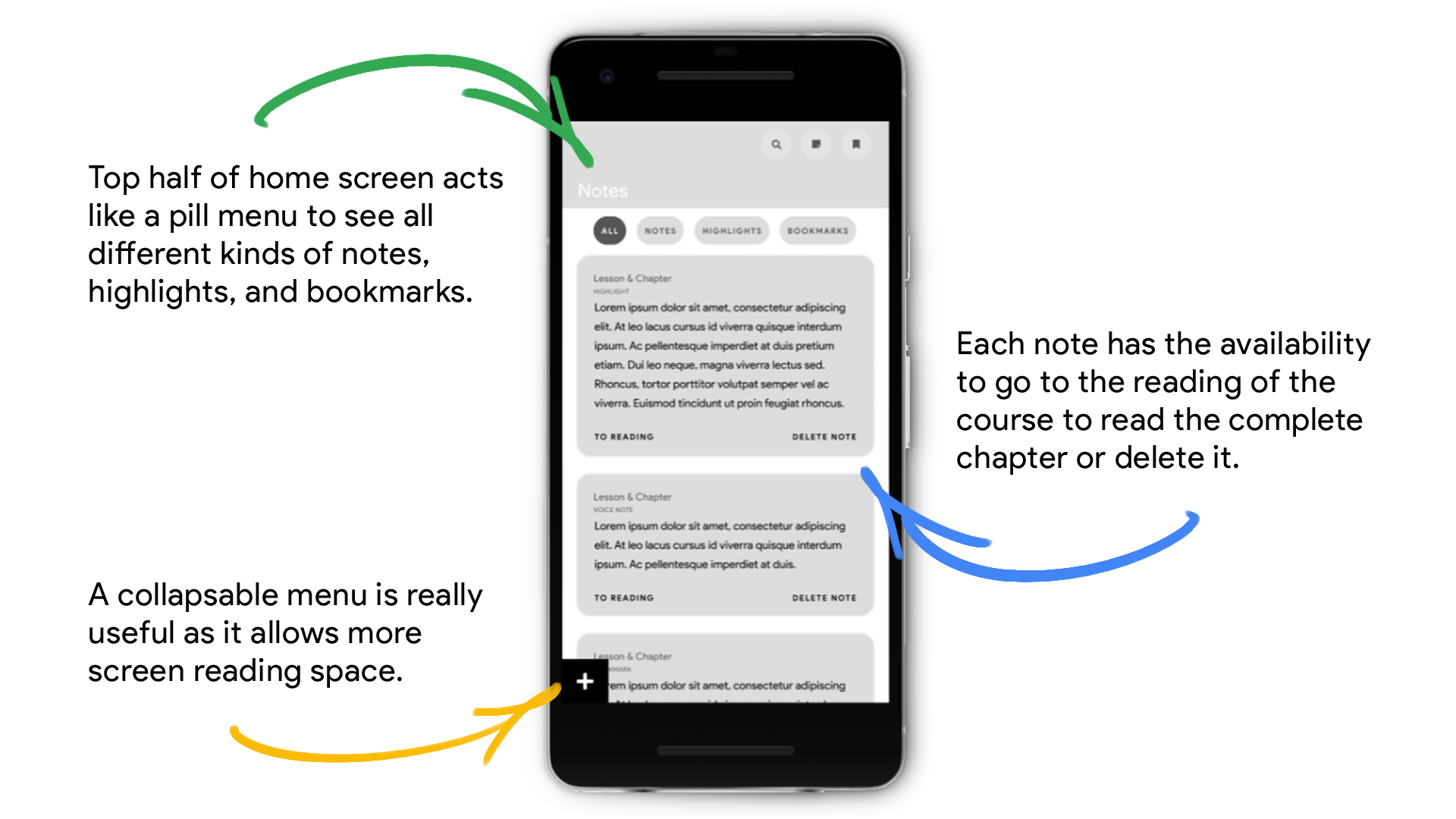
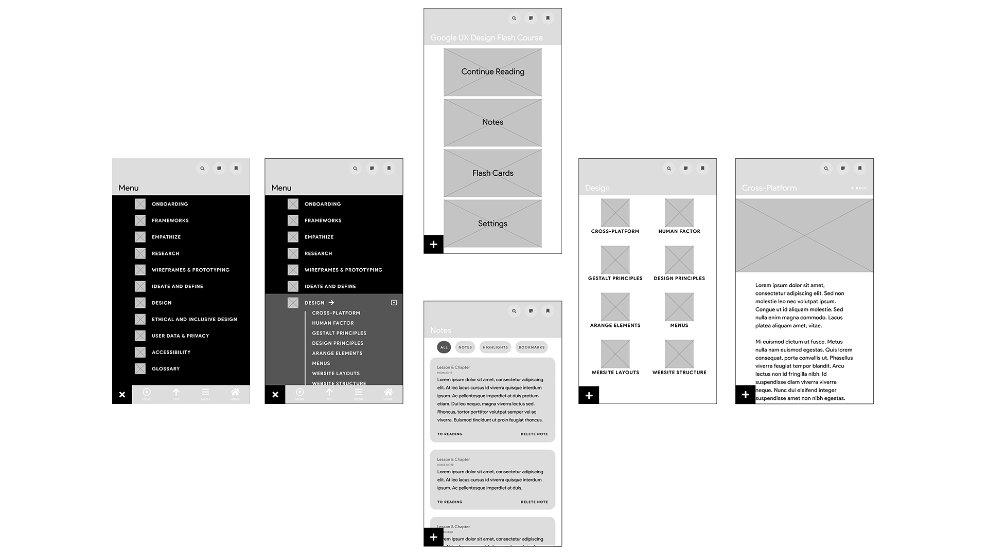
After ideating and drafting some paper wireframes, I created the initial designs for the Flash Course app. These designs focused on delivering personalized guidance to users to help locate and review course’s material.
LOW-FIDELITY PROTOTYPE
To prepare for usability testing, I created a low-fidelity prototype that connected the user flow of how the general app would work. I created a Notes section and Flashcards so users could study the course in a fun and interactive way. A large button was added so students could continue reading the material where they last left off.
Usability Study
PARAMETERS
study type
Unmoderated usability study.
location
USA, remote.
participants
5 participants.
length
Less than 60 minutes.
FINDINGS
better menu
Users want quick, easy access to course information and their own notes.
study
People wanted to see if there could be a way to review course material.
settings
Students need to pick their own preferences especially with the position of the menu button.
Refining the Design
MOCKUPS
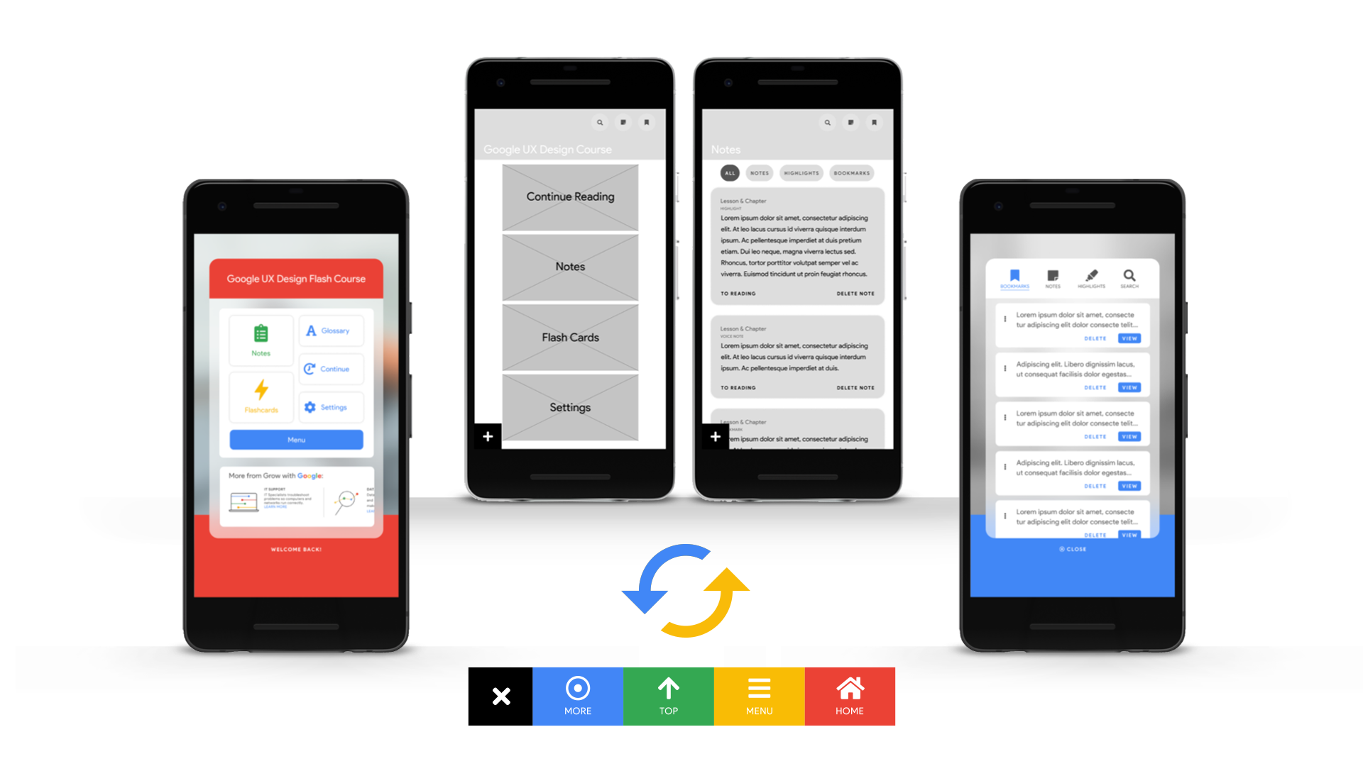
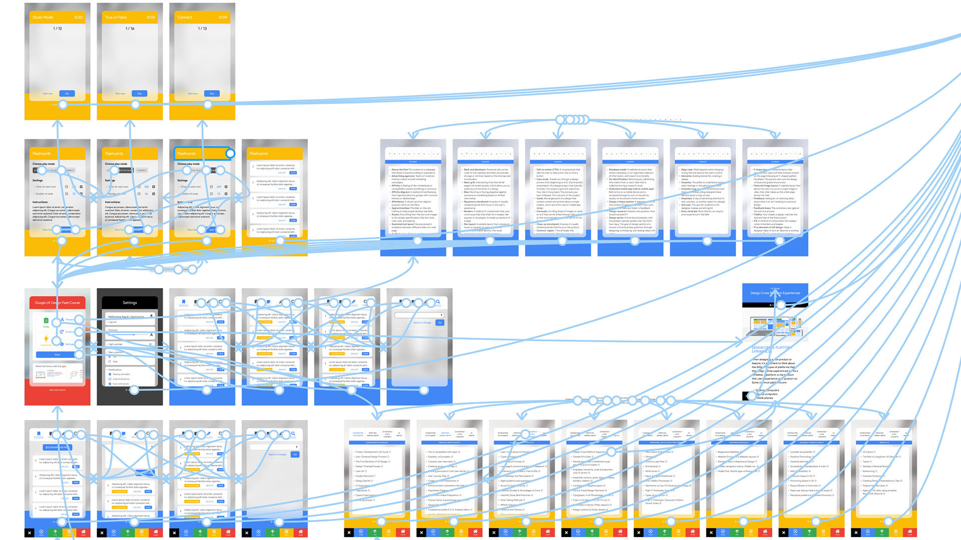
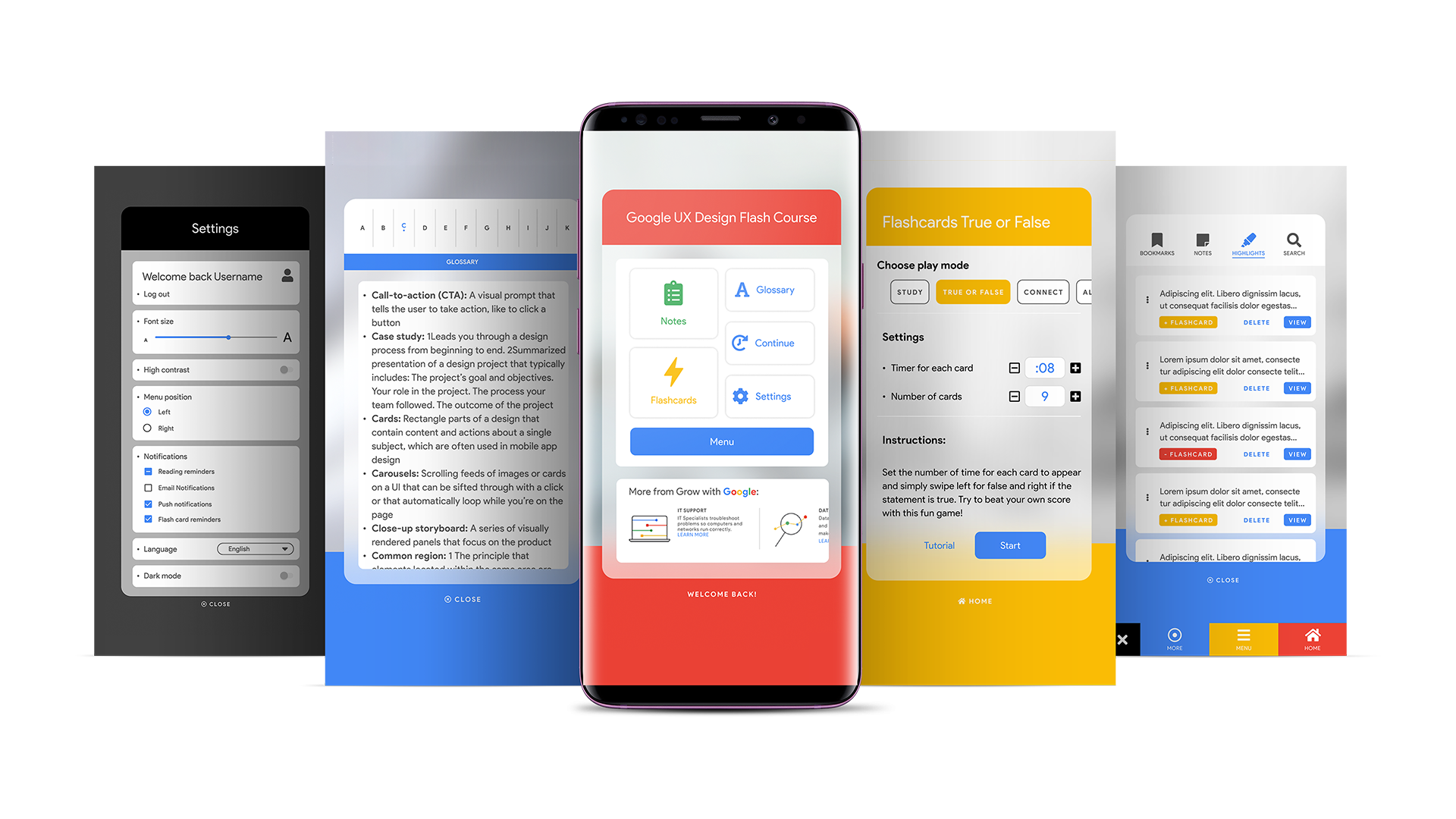
Based on the insights from usability studies, I applied design changes, providing a more clear home screen. Additional design changes included adding labels to icons so the user could get started quickly and without any type of hassle or confusion.
HIGH-FIDELITY PROTOTYPE
The high-fidelity prototype user flow was improved from the low-fidelity prototype, including design changes made after the usability study.
ACCESSIBILITY CONSIDERATIONS
screen readers
Icons with labels and alt text were added to images and interactive elements so they could be read by screen readers.
high-contrast
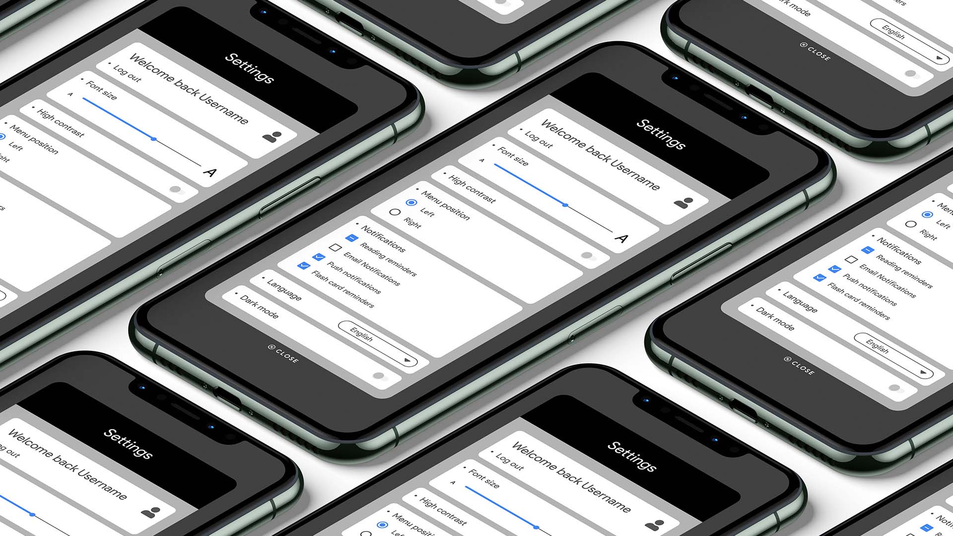
A setting for high-contrast was added. A light and dark mode setting was added, and font size can be adjusted by the user.
languages
The option to take courses in different languages other than English was added to the settings menu.
Screen Size Variations
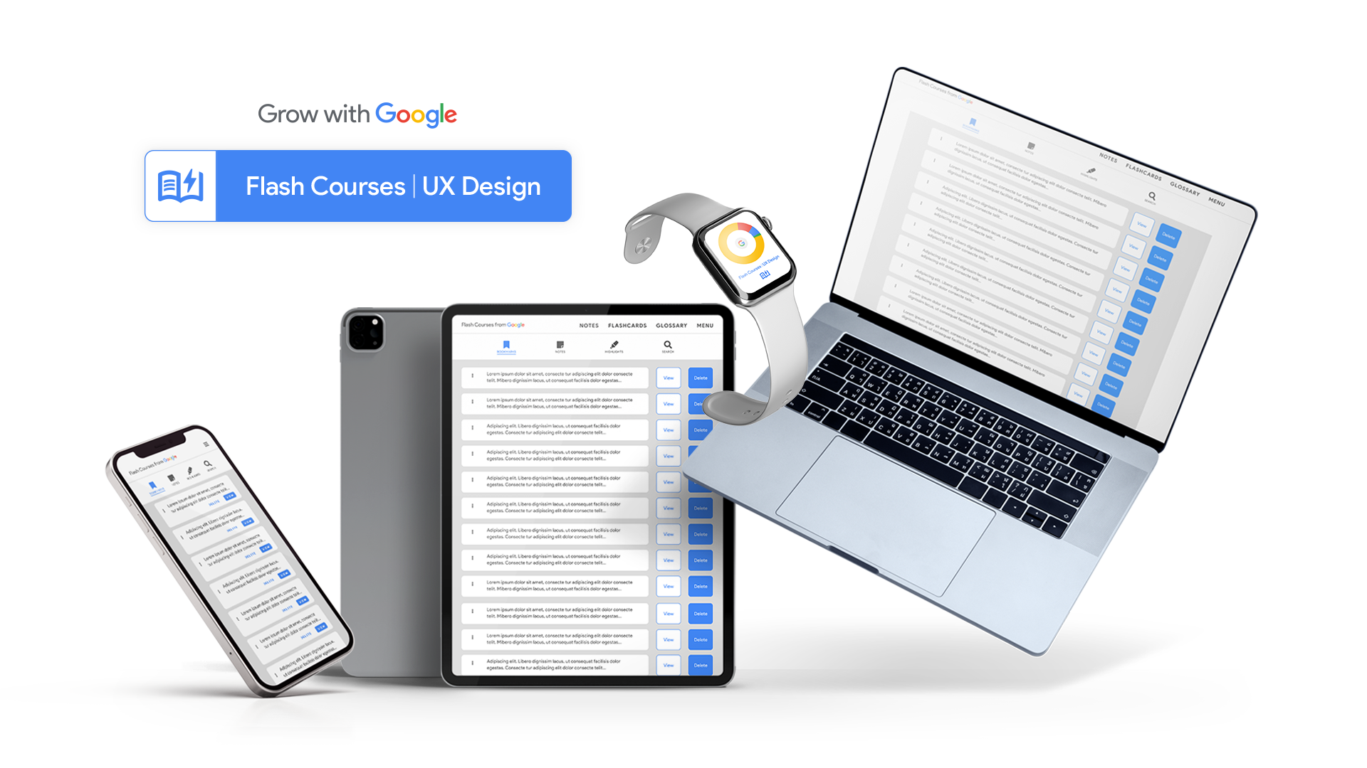
I addition to the mobile app, I designed a responsive website for the Course. The designs for screen size variation included mobile, tablet, and desktop. I optimized the designs to fit the specific user needs of each device and screen size.
Going Forward
TAKEAWAYS
impact
Users shared that the app made the course easier to read and more intuitive. One quote from peer feedback was that “this app is way better than the Coursera's course, wow!”
learnings
I learned that even though the problem I was trying to solve was a big one, going through each step of the design process and aligning with specific user needs, helped me come up with solutions that were both feasible and useful.
NEXT STEPS
research
Conduct research on how successful the app is in reaching the goal to encourage people to study and learn new skills.
courses
Add more educational courses for users to learn about different subjects and new technologies.
incentives
Provide incentives to users that finish a Flash Course. Similar to a certificate or badge so they can include it in their LinkedIn profile and/or resume.


