arturo
morales
m

Overview
Flash Courses was a self-initiated UX concept I developed during the Google UX Design Certificate program, inspired by the real challenges I experienced while taking the course. Although Google’s certification is free, it was hosted on Coursera, which adds subscription costs and requires a heavy time commitment — often out of reach for people with multiple jobs or limited schedules. I set out to design a simpler, faster, and completely free alternative: A mobile-first learning app offering bite-sized lessons, built around accessibility, inclusion, and real empathy for modern learners.
SOFTWARE
AdobeCC
Photoshop
Illustrator
Figma
CHANNELS
Digital
B2C
SKILLS
Art Direction
Graphic Design
Creative
Web UX/UI Design
•→ Flash Courses by Grow with Google
Rethinking online education for accessibility, speed, and inclusivity
This self-initiated UX case study explores how certificate-based education could become faster, more accessible, and better suited for people with busy lives. The idea for Flash Courses came after completing the Google UX Design Certificate and seeing firsthand how many learners struggled with Coursera’s format — not because of the content, but because of time constraints, cost, and limited collaboration tools.
I set out to reimagine the experience: what if Google offered its own platform — simpler, faster, and completely free — designed around real-world accessibility and user needs?

•→ Project Overview
Designing a faster, more inclusive way to learn online
The Problem
Many learners juggle multiple jobs and responsibilities, leaving little time for long-format courses. Even though Google’s certificate programs are free, they’re hosted on Coursera — which charges a monthly fee that creates an accessibility barrier.
The Goal: Design an app that delivers condensed Certificate Courses without tests or fees — a simplified, 100% free platform where anyone can learn at their own pace.
The Product: Flash Courses from Grow with Google was conceived as a quick-learning tool for adults and multitaskers eager to gain new skills efficiently. It focuses on practical, flexible education — enabling users to learn in minutes, not months.
My Role: UX Designer, Researcher, and Project Lead. I guided the app and responsive site design from concept to final delivery, ensuring visual and functional consistency across touchpoints.
Project Duration: September 2021 – November 2021
Responsibilities: Conducting user interviews, research analysis, and affinity mapping; building paper and digital wireframes; developing low- and high-fidelity prototypes; running usability tests; and refining for accessibility, information architecture, and responsiveness.

•→ Understanding the User
Listening to real frustrations to uncover meaningful opportunities
Using Coursera’s public feedback as research data, I identified recurring pain points — from plagiarism and inconsistent peer reviews to the frustration of English-only courses. Many users expressed interest in a version of the course that could be accessed directly through Google without fees or barriers. This insight drove the foundation of Flash Courses: a learning experience that values accessibility, integrity, and global inclusion.
Additional User Pain Points
Mapping real human frustrations to design solutions:
Experience: Many users wanted meaningful interaction, but the commenting system often lacked engagement.
Plagiarism: Reviews revealed frequent content copying, diminishing the quality of peer review.
Language: Since the course was only offered in English, many non-native speakers were left out of the opportunity to learn.
I also built personas to humanize the problem — like Drew, who juggles two jobs and studies during his commute, and Mary, who wants to reskill without quitting her current role.


•→ Competitive Audit
Studying the market to find gaps in the e-learning experience
To identify market gaps, I analyzed existing education platforms. This competitive audit and audit report, clarified how most options were either paywalled, lengthy, or overly academic. These insights helped shape Flash Courses as a fast, no-cost alternative centered on practical usability.

•→ Starting the Design
Turning insights into structure, sketches, and strategy
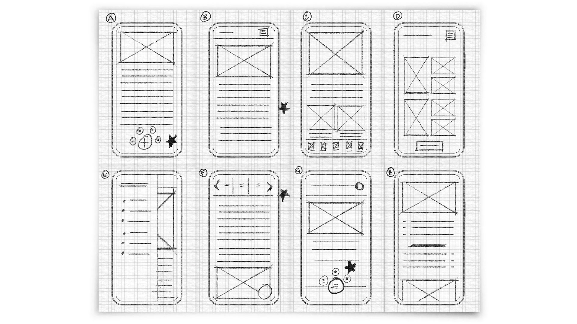
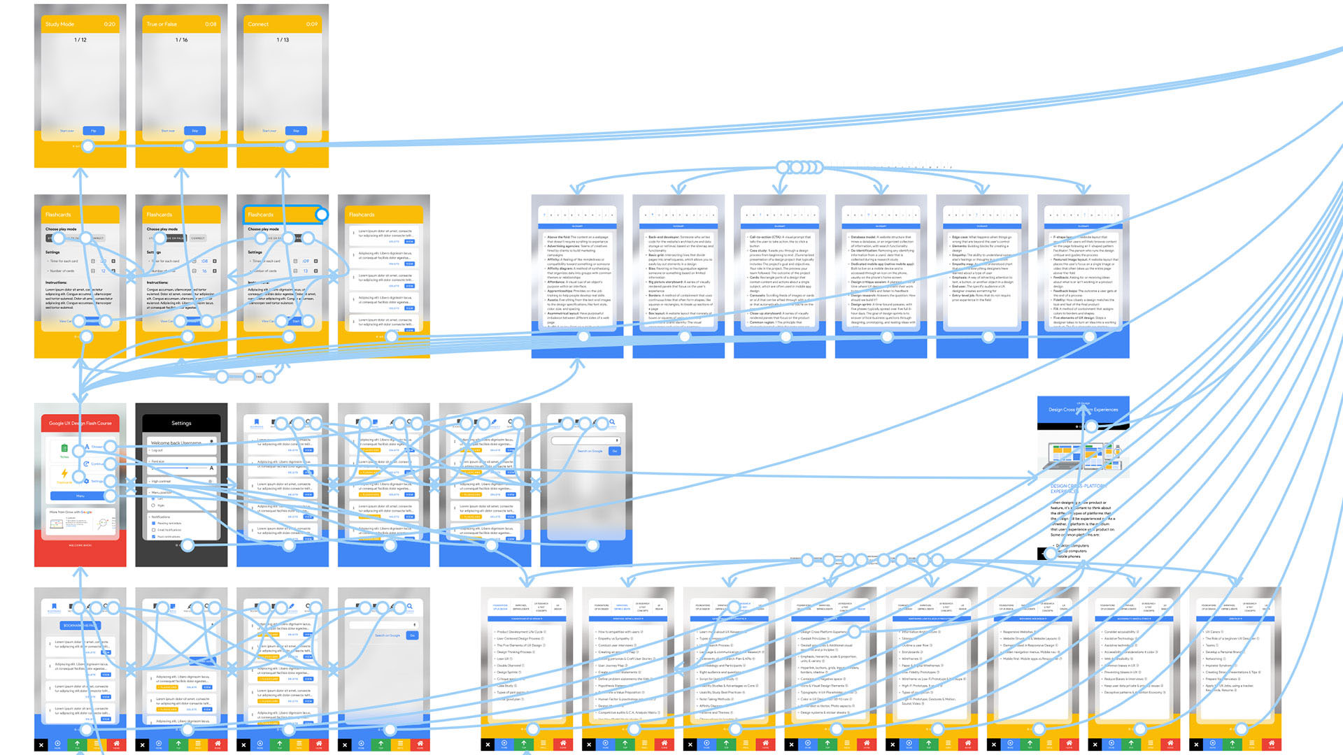
I began by mapping out the information architecture, restructuring the original Google UX Design lessons into a more intuitive flow. During ideation, I ran a series of quick sketching exercises to visualize user-friendly interfaces, emphasizing large touch targets and clear navigation.
The wireframes focused on clarity and space — a collapsible menu, notes, flashcards, and bookmarks that users could easily revisit. From there, I built a low-fidelity prototype connecting all sections into a smooth, scrollable experience optimized for mobile.


•→ Usability Study
Parameters & Key Findings
Testing the concept to ensure a seamless learning experience
Study Type: Unmoderated usability study
Location: Remote — USA
Participants: 5 users
Session Length: Under 60 minutes
Better Menu: Users wanted faster access to notes and key course sections without excessive scrolling.
Study Options: Participants suggested a dedicated section to review or revisit course material independently.
Settings Customization: Learners valued the ability to personalize their experience, especially controlling menu placement and interface preferences.
•→ Refining the Design
Mockups & High-Fidelity Protoype
From prototype to polished — accessibility meets usability
Based on feedback, I introduced labeled icons, improved home navigation, and enhanced readability. The high-fidelity prototype reflected a cohesive, accessible layout designed for both speed and comfort.
Accessibility was central — I added screen reader support, high-contrast modes, and multilingual options, ensuring that Flash Courses could be inclusive by design.

•→ Accessibility Considerations
Designing for clarity, comfort, and inclusion
Screen Readers: Added clear labels and alt text to icons and interactive elements, ensuring compatibility with screen readers and assistive technologies.
High Contrast: Implemented a high-contrast setting along with light and dark modes, plus adjustable font sizes — giving users full control over readability.
Languages: Expanded access by introducing multilingual options, allowing users to take courses in languages beyond English through the settings menu.

•→ Screen Size Variations
Designing for flexibility and consistency
In addition to the mobile app, a responsive website was designed to ensure accessibility across all devices — including mobile, tablet, and desktop. Each layout was carefully optimized to meet the unique needs and behaviors of users on different screen sizes, maintaining consistency and usability throughout the experience.

•→ Going Forward
Takeaways & Next Steps
Impact
Users found the app easier to read and more intuitive.
Feedback highlighted that the experience was smoother and more enjoyable than similar courses.
One user even shared: “This app is way better than Coursera’s course — wow!”
Learnings
Learned that solving a large-scale problem requires breaking it down into smaller, actionable steps.
Following the design process closely helped align with real user needs.
The process led to solutions that were not only feasible but genuinely useful to users.
Research
Conduct follow-up studies to measure the app’s success in encouraging users to study and learn new skills.
Evaluate engagement levels and long-term learning outcomes.
Courses
Expand the content library with additional subjects and up-to-date tech topics.
Offer more micro-learning opportunities for quick, accessible skill-building.
Incentives
Introduce completion rewards, such as certificates or digital badges.
Enable users to showcase achievements on platforms like LinkedIn or their resumes.
Final Note
Design for Good: turning everyday frustrations into opportunities for change
Although Flash Courses isn’t an official Google product, it represents how I approach UX challenges: finding friction, understanding people, and designing solutions that make learning (and life) simpler. This case study was part of my “Design for Good” series — a creative exercise in turning insight into action.
