


arturo
morales
m

Overview
The goal for Sico Condoms, was to remove the taboo and bring the brand closer to real life. The campaign “It Happens” turned moments of intimacy into bold, unapologetic expressions of confidence. The visual language used high-contrast duotones, playful typography, and vibrant gradients to capture the spontaneity of desire while positioning Sico as a brand that celebrates freedom, fun, and responsibility.
SOFTWARE
AdobeCC
Photoshop
Illustrator
Lightroom
CHANNELS
ATL
BTL
Digital
B2C
SKILLS
Art Direction
Graphic Design
Retouching
Creative
Photography
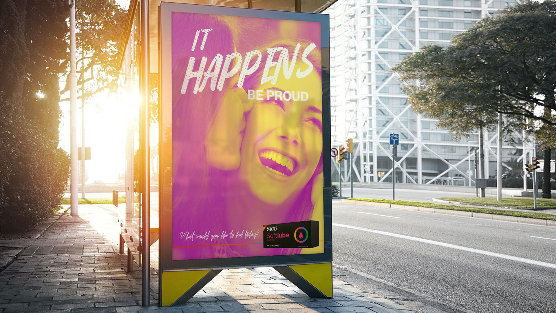
•→ Billboards & Master Graphics
Own the moment — it happens
The It Happens campaign launched across major cities with striking outdoor visuals that couldn’t be ignored. Using bold color overlays in pink, purple, and yellow, the creative direction evoked heat and energy, breaking away from the clinical tone often seen in the category. Each image was manually retouched — before the AI era — to balance sensuality and sophistication through realistic light play, contrast, and texture refinement.

•→ Brand Design & Print Collateral
Bold visuals, unified identity
This phase focused on creating a cohesive brand system that extended across print and packaging. Magazine ads brought the same electrifying tone to lifestyle publications, while the new packaging redesign gave Sico’s product line a modern, premium look. The packaging system was restructured around color-coded identities for each sensation — Heat, Extra Pleasure, Mutual Climax, and more — giving the brand instant shelf recognition and consistency across retail environments.


•→ Swag & Experience Design
The Sico Collective — design that teases curiosity
To complement the It Happens campaign, we designed The Sico Collective: a curated welcome kit that combined sleek design with playful touchpoints. The packaging — a matte black box sealed with minimal branding — opened to reveal product samples, game dice, and a personalized invitation card, each element designed to encourage exploration and fun. The project extended the brand beyond product — turning Sico into a lifestyle experience centered around confidence, connection, and pleasure.


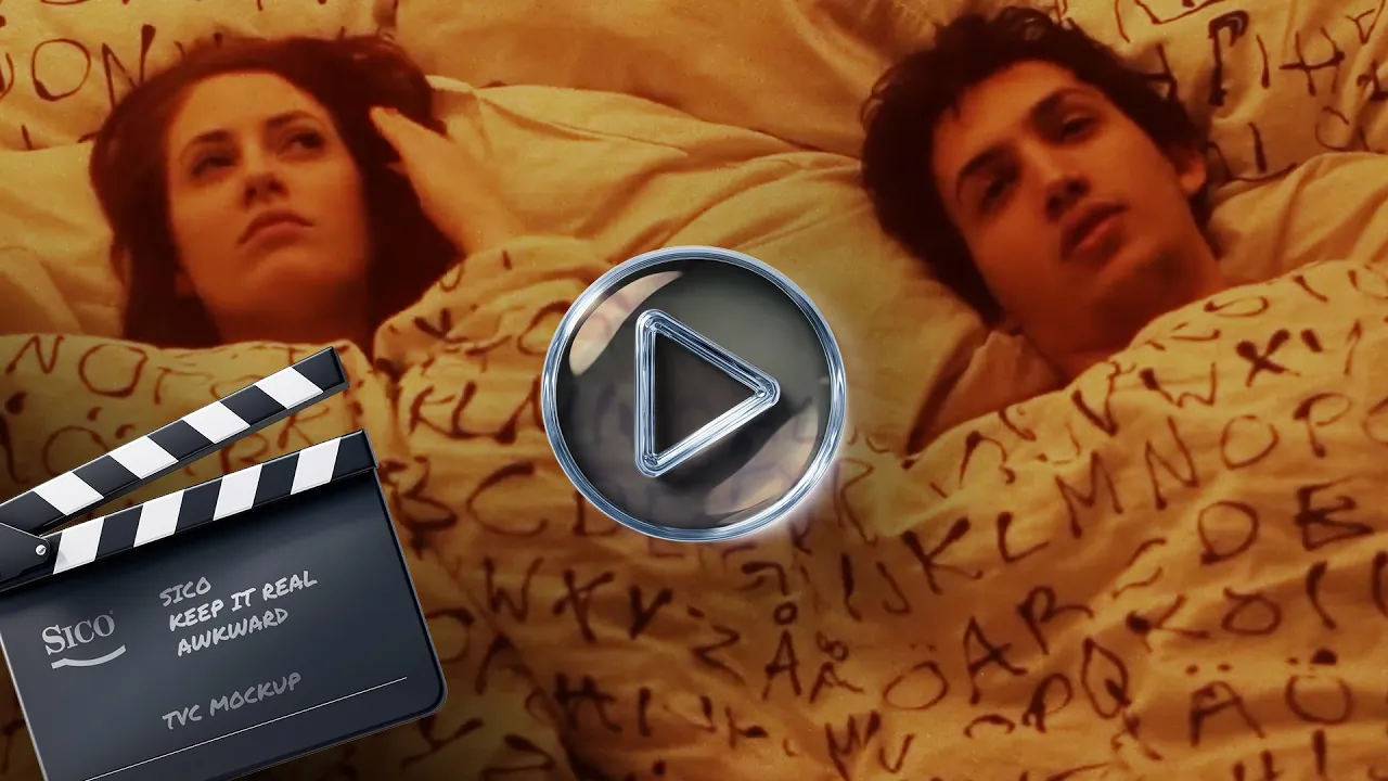
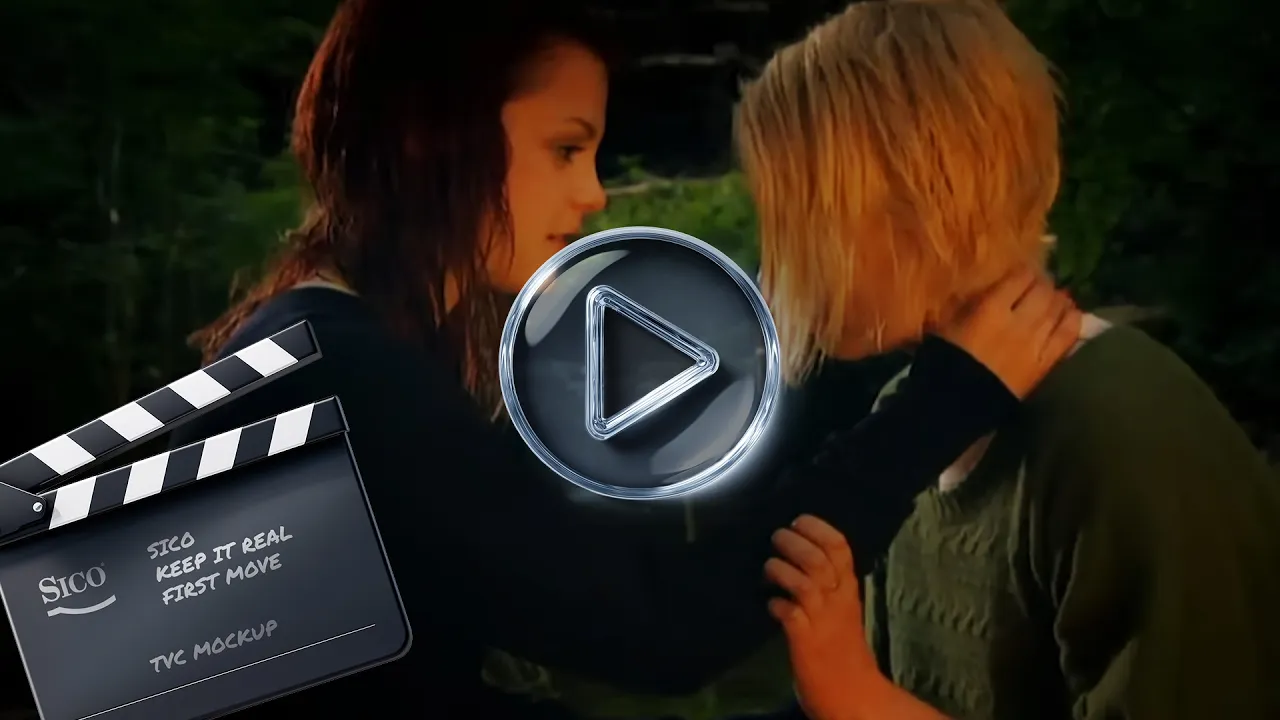
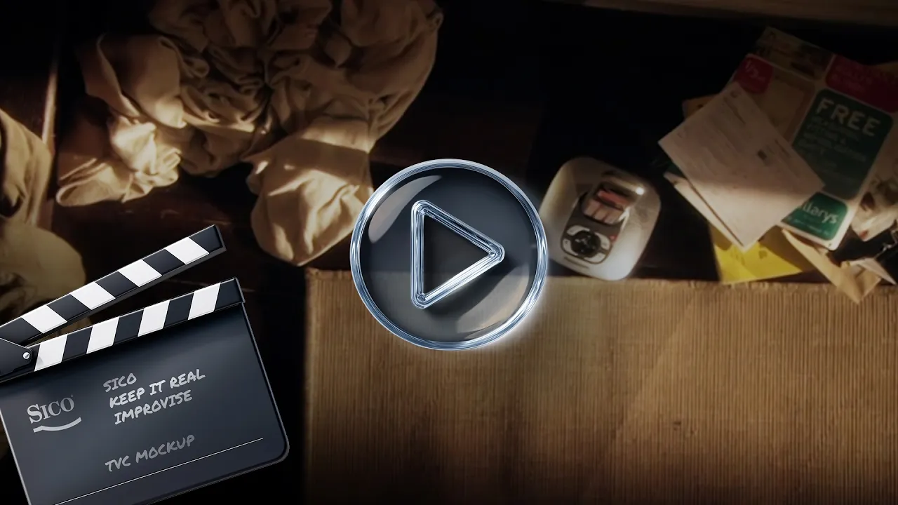
•→ TV Commercials
Unreleased Mockups
A series of unreleased TV concepts developed during the early stages of the campaign. Originally titled Keep It Real, this work explores the raw, unfiltered direction that eventually evolved into It Happens.

© 2026 Copyright. Arturo Morales. All rights reserved.
© 2026 Copyright. Arturo Morales. All rights reserved.
© 2026 Copyright. Arturo Morales. All rights reserved.